
Storefront
A public page for your community, built in the dashboard, with your plans, one-time products and donations on one link that members can buy from without joining first.
The storefront is one public page per community at arcalotl.com/s/<your-link>.
It lists your plans, one-time products and donations with a Join button on
each, in a look you pick and adjust in the dashboard. Members sign in with
the same account they use for the member portal
and pay through the same checkout your bot uses; the role or entitlement
lands the same way.
Open Storefront in the server navigation to build it.
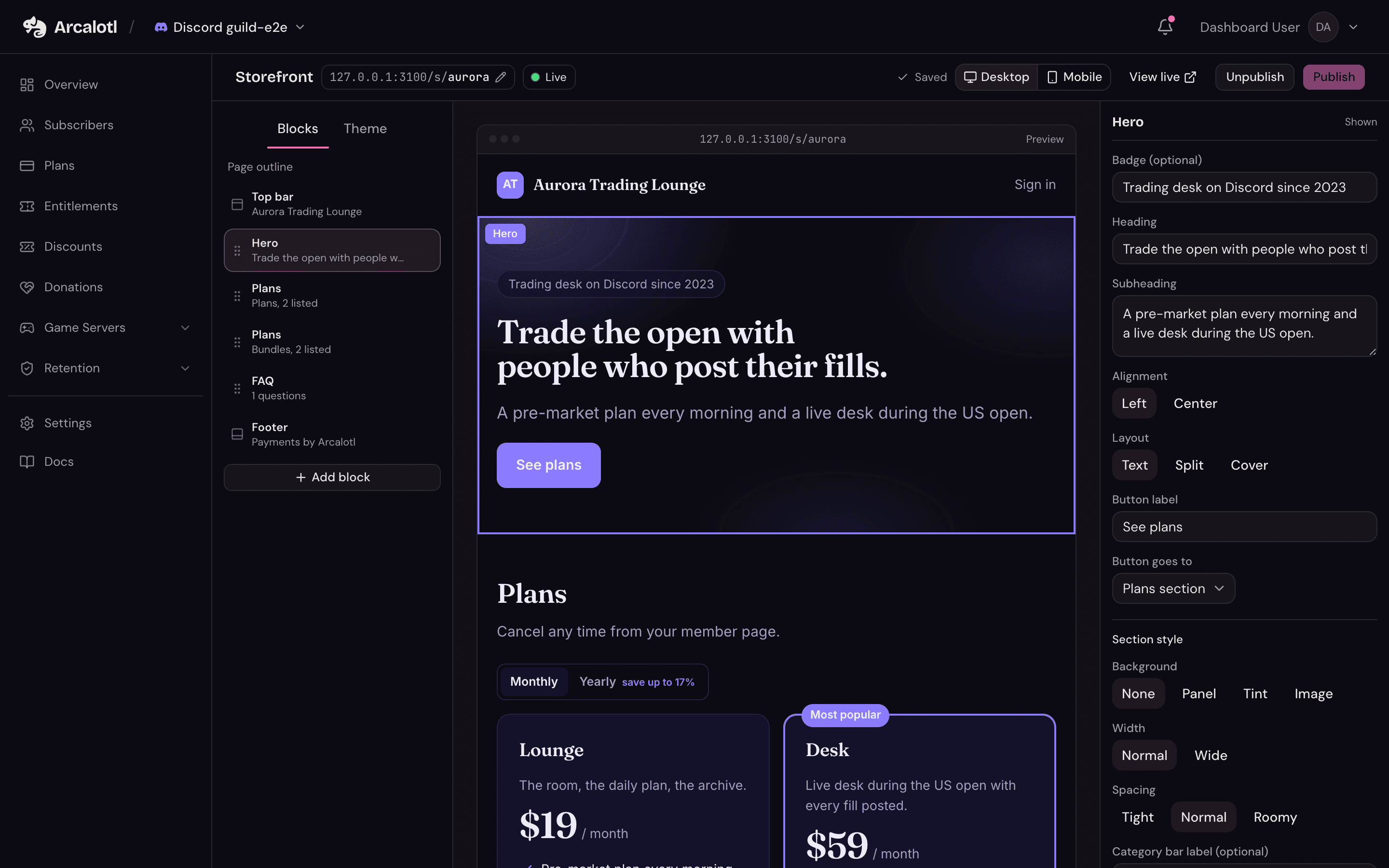
Start from a template
The first time you open the builder it holds a plain page with your active plans already on it. Pick a template under the Theme tab to replace the page with a designed one: your plans are kept and spread across the template's sections.
| Template | For |
|---|---|
| Arcalotl | Any community that wants the store to match the dashboard |
| Midnight, Paper, Neon, Minimal | Creator, trading, editorial and product communities |
| Aurora, Atelier, Mono, Tropic | Streamers, art and writing, developers, fitness and lifestyle |
| Minecraft, Hytale, Orbis, Deepslate | Game servers: ranks, crate keys, kits, server address |
A template can be applied any number of times before you publish. After publishing, applying one still replaces the draft, and the live page only changes when you publish again.
Blocks
A page is a list of blocks. The outline on the left shows them in order; drag the grip to reorder, use the eye to hide one without deleting it, and click Add block for more. Each block has its own settings on the right, plus a Section style with a background (panel, tint or image), width, spacing and a label for the category bar.
| Block | What it shows |
|---|---|
| Hero | Headline, subheading and button: as text on the page background or your own image, split beside an image, or over a cover image |
| Plans | A grid of plans. Several grids make categories: memberships, products, donations |
| Text and media | A paragraph beside an image or a YouTube or Vimeo video |
| Gallery | Two to four columns of images with captions |
| Countdown | A live countdown to a date, for seasons and launches |
| Features, Stats | Icon rows and headline numbers |
| Testimonials | Quotes with a name and role |
| FAQ, Rich text | Questions with answers; formatted text in one or two columns |
| Server address | A game server address with a copy button and a version line |
| Image, Video | One picture with shape and frame options; one embedded video |
| Call to action | A heading, a line and a button |
| Socials | Links to Discord, YouTube, Twitch, X, TikTok and your site |
| Announcement | A bar across the top of the page |
Plans and categories
A Plans block lists any of your active plans. Its Card style is either plan cards (price, interval, features) or product cards (an image, a line, a Buy button), and each plan can carry its own image, label and badge on that grid. Turn on Show a category bar above this grid on the first Plans block to get a pill bar that jumps between every grid and every block with a section label. The bar can stay pinned while the page scrolls.
Prices, intervals and trial days come from your plans; changes made on the Plans page reach the live store within a few minutes.
Top bar and footer
The top bar and the footer are selectable like blocks, from the outline or by clicking them in the preview. The top bar takes a logo, a name, up to four links to sections or outside pages, and a sticky option. The footer takes a tagline and can repeat your social links. Both carry a Members sign in link unless you switch it off; a signed-in member sees their name and a menu with Manage membership and Sign out instead. The footer also carries a language picker, which you can hide; see Set your members' language.
Theme
Under Theme: a palette (fourteen curated ones, dark, light or system), an accent colour, a type pairing, corner radius and the hero background (solid, gradient, mesh or an image with darken, blur and focus controls). Every palette and pairing passes contrast checks, so there is no custom CSS to maintain.
Images
Every image picker offers the built-in library first and your uploads after. Uploads are PNG, JPEG or WebP up to 5 MB, and each gets fit, focus and frame options where it is used. The image library ships with Arcalotl: official Minecraft and Hytale art for the game templates and high-resolution photos for the rest, so a template looks finished before you upload anything.
Publishing
The builder saves as you edit. Publish puts the current draft live at your link and Unpublish takes the page down, answering not found to visitors. Change your link picks the slug; it can be changed later, and the old link stops working.
Publishing needs at least one active plan on the page and a connected payment account. Until then the Join buttons show what members will see, but do not start a checkout.
Sharing the link
- In Discord,
/arcalotl storefrontreplies with the live link to an admin and offers Post to channel, which drops a card with the link and your top plans into the current channel. In Fluxer and Stoat the same command (!arcalotl storefronton Stoat) replies with the card privately. Telegram has no storefront command; copy the link from the dashboard and share it in the chat. - The public page carries a social image, a description and a canonical link, so it previews cleanly when shared and can be found by search.
What members see
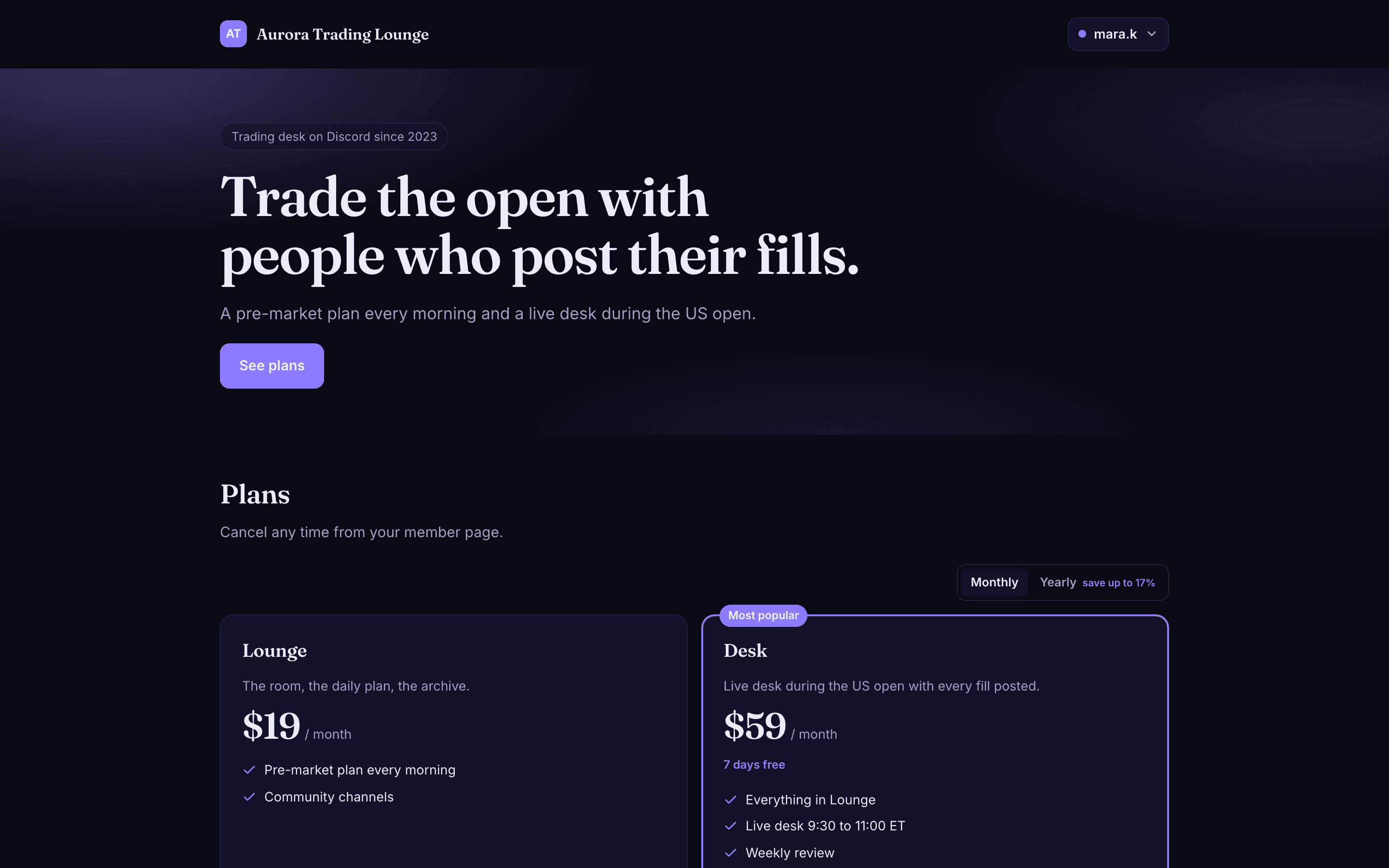
Join opens a sheet that asks the member to sign in with one of the community's platforms if they have not yet, then hands off to checkout. After paying, they land back on the store with a welcome line and the access is delivered as usual. A member who already belongs sees their name in the top bar and can reach the member portal from there.